
Style-facts part6
In the last chapter of the style facts we learned how to use borders and shadows. This time we learn how to put this to practice, by making our own toggle switch from a checkbox and label. Finally something we can use in a real corporate environment.
Most of us do not know what a default check input looks like. That is probably ok, because these things are ugly. We could make a fancy and nice looking checkbox, but let's skip that altogether and make a shiny hip toggle switch. Those are way cooler than checkboxes. The elements we need for this are a checkbox input and a label tag.
'For' the win
Visually we only need the label. We stated earlier that the default checkbox was ugly, so we don't need that. We only needs its functionality. So How do we transfer that to the label? To do this we add an 'id'-attribute to the input and a 'for'-attribute to the label, taking the id from the checkbox input as input. Now we can click the label and the checkbox is getting checked and unchecked! Wonderful.
<input type="checkbox" id="switch"/>

<label for="switch"></label>
Sibling combinators and labels in the switch
So how can we make the label do 'on' and 'off' like a switch? Part of the answer is in the title of this subsection.
We will use the direct sibling combinator to check if the input is checked and adapt the label styling accordingly.
The selectors we will use look something like this:
.switch { // off }
#switch:checked + .switch { // on }
We will use the background the base of our toggle button that changes color. If the input is ':checked', the background color will be green. Like a backlight. In default state it will be gray, like it is disabled. We will use a transition to make the light green color come up.
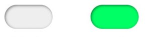 label checked
Toggling the switch
A before pseudo-element will be our toggling pin. Its will move from left to right when the input is checked. To smooth this out we put a transition on the 'left' of the before. And the background The after pseudo-element will make our on and off label. We hardcode the text for now, we'll come back to that later.
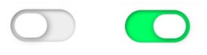 toggle switch unchecked / checked
Our toggle button is now toggling!!
We probably want dynamic text we can adapt to language in our styling. Let's clean that up by incorporating some 'on' and 'off' data-labels. So we can put translation bindings in this. For this we use attributes 'data-on' and 'data-off' on the label. Now we can replace content: 'on' by content: attr(data-on); and replace content: 'off' by content: attr(data-off); Our toggle button is now finished! Here's the codepen.
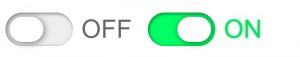 toggle switch off / on
Hopefully you will use this switch styling to switch from old checkboxes to fancy switches. So from now you can:

And as always leave comments below for questions and remarks!
The next blog will be in the new year :)
Happy Hollidays!
Finally got some reading time? Read the rest of the series here:
Part5: https://www.mavention.nl/techblog/borders-and-shadows-make-design-magic
Part 4: https://www.mavention.nl/techblog/how-to-make-a-responsive-grid/
Part 3: https://www.mavention.nl/blogs-cat/3-levels-of-css-selectors-to-select-all-elements/
Part2: https://www.mavention.nl/blogs-cat/shaping-elements-and-its-surrounding/
Part1: https://www.mavention.nl/blogs-cat/2-basics-you-need-to-know-to-position-elements/

