
With the property pane we can defer from hard coding configurations into web parts. Like references to lists, databases, but also defining text labels or custom colors and styling. Those choices can be made when deploying the web part and always be changed very easily.
This blog is not an introduction in how SPFx web part work or the property pane for that matter. I just want to share two cool ideas we that used in a recent project to create dynamic property panes for your SPFx solutions.
One solution allows the user to decide whether he wants to use custom colors for the webpart. If the user wants to use custom colors, the property pane will be extended so the user can pick those custom colors. The second one creates options based on a term set that will be used in the web part.
With both examples I will show and explain the key points. I have uploaded the solution to GitHub so you can check the full solution there.
Let’s start with the custom colors. I have setup a simple web part that takes some colors based on the theme of the site:
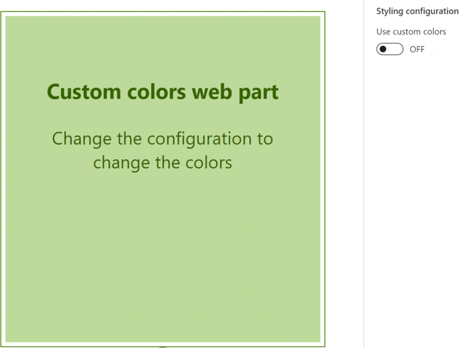
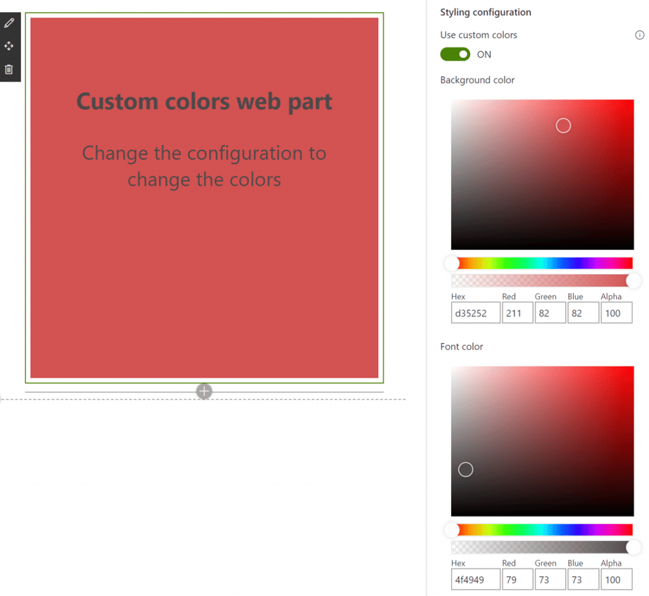
As you can see there is a toggle 'Use custom colors'. If you used, you will get two color pickers in your property pane that allow for custom color selection:
You can do this with the use of the ‘getPropertyPaneConfiguration’ method of your webpart (located in the webpart.ts file). This method ‘creates’ your property pane. I edited mine, so it looked this:
   protected getPropertyPaneConfiguration(): IPropertyPaneConfiguration {


   return


    {
 pages: [
 {
 groups: [
 {
 groupName:


   '


   Styling configuration


   '


   ,
 groupFields: [
 PropertyFieldToggleWithCallout(


   '


   customColorsEnabled


   '


   , {
 calloutTrigger: CalloutTriggers.Hover,
 key:


   '


   toggleCustomColors


   '


   ,
 label:


   '


   Use custom colors


   '


   ,
 calloutContent: React.createElement(


   '


   p


   '


   , {},


   '


   Switch this to use custom styling


   '


   ),
 onText:


   '


   ON


   '


   ,
 offText:


   '


   OFF


   '


   ,
 checked:


   this


   .properties.customColorsEnabled
 }),
 ...


   this


   .customColorPickers(


   this


   .properties.customColorsEnabled)
 ]
 }
 ]
 }
 ]
 };
 }
First, we have a toggle control. This control the customColorsEnabled property. But the second property control in the group isn’t a control but a function: ‘customColorPickers’. This function looks like this:
   private customColorPickers(customColorsEnabled:


   boolean


   ): IPropertyPaneField


   <


   IPropertyFieldColorPickerProps


   >


   [] {


   if


    (customColorsEnabled) {


   return


    [
 PropertyFieldColorPicker(


   '


   backgroundColor


   '


   , {
 label:


   '


   Background color


   '


   ,
 selectedColor:


   this


   .properties.backgroundColor,
 onPropertyChange:


   this


   .onPropertyPaneFieldChanged,
 properties:


   this


   .properties,
 disabled:


   false


   ,
 alphaSliderHidden:


   false


   ,
 style: PropertyFieldColorPickerStyle.Full,
 iconName:


   '


   Precipitation


   '


   ,
 key:


   '


   backgroundColorFieldId


   '


 }),
 PropertyFieldColorPicker(


   '


   fontColor


   '


   , {
 label:


   '


   Font color


   '


   ,
 selectedColor:


   this


   .properties.fontColor,
 onPropertyChange:


   this


   .onPropertyPaneFieldChanged,
 properties:


   this


   .properties,
 disabled:


   false


   ,
 alphaSliderHidden:


   false


   ,
 style: PropertyFieldColorPickerStyle.Full,
 iconName:


   '


   Precipitation


   '


   ,
 key:


   '


   fontColorFieldId


   '


 })
 ];
 }


   else


    {


   return


    [];
 }
 }
The SPFx framework will render the ‘getPropertyPaneConfiguration’ every time some property changes. If we then flick the switch and are using custom colors the ‘customColorPickers’ method will be called again. Depending on whether we are using custom colors in that state will then either return more controls or just an empty array. This way the property pane is dependent on choices we make in that same property pane.
Next is building your property pane based on a term set. The use case for us was a web part that searched and displayed content. This content had a managed metadata field that functioned as a label. We wanted to be able to configure the color for each label. So we wanted a color picker for each term that we used.
Let me quickly show you a (simplified) example:
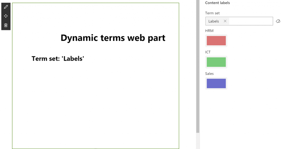
In the property pane the first field is a termpicker. With this term picker we select the term set that provides the labels. This term set holds 3 labels. For each of the labels a color picker is created. As you can see the web part then lists the three terms with the color we set.
The ‘getPropertyPaneConfiguration’ method looks like this:
   protected getPropertyPaneConfiguration(): IPropertyPaneConfiguration {
 let labelsPropertiesGroup: IPropertyPaneGroup


   =


    {
 groupName:


   '


   Content labels


   '


   ,
 groupFields: [
 PropertyFieldTermPicker(


   '


   termSet


   '


   , {
 allowMultipleSelections:


   false


   ,
 context:


   this


   .context,
 excludeSystemGroup:


   true


   ,
 initialValues:


   this


   .properties.termSet,
 isTermSetSelectable:


   true


   ,
 key:


   '


   termSetsPickerFieldId


   '


   ,
 label:


   '


   Term set


   '


   ,
 onPropertyChange: (propertyPath: string, oldValue: any, newValue: any)


   =>


   this


   .changeLabelTermSet(newValue),
 panelTitle:


   '


   Select a term set for labels


   '


   ,
 properties:


   this


   .properties,
 })
 ]
 };  if (this.properties.termSetSelected) {
 let colorPickers = this.constructColorPickers();
 if (colorPickers) {
 colorPickers.forEach(colorPicker => {
 labelsPropertiesGroup.groupFields.push(colorPicker);
 });
 }
 }  return {
 pages: [
 {
 groups: [
 labelsPropertiesGroup
 ]
 }
 ]
 };
 }
What we do is create a group of fields with just the term picker in there to select the term set and store this group in a variable. We check if there is a term selected and if that is the case, we construct the color pickers. These color pickers are added to the group that is stored in the variable. That variable is then returned as the outcome of the method that provides the property pane.
The construct color pickers method:
   private constructColorPickers(): IPropertyPaneField


   <


   IPropertyFieldColorPickerProps


   >


   [] {


   if


    (


   this


   .properties.termSetSelected) {


   if


    (


   this


   .properties.terms


   !==


    undefined


   &&


   this


   .properties.terms


   !==


   null


   ) {
 let colorPickers: IPropertyPaneField


   <


   IPropertyFieldColorPickerProps


   >


   []


   =


    [];


   this


   .properties.terms.forEach(term


   =>


    {
 colorPickers.push(PropertyFieldColorPickerMini(term.id, {
 label: term.name,
 initialColor: term.color,
 onPropertyChange: (propertyPath: string, oldValue: string, newValue: string)


   =>


   this


   .updateLabelColorField(term.id, newValue),
 render:


   this


   .render.bind(


   this


   ),
 disableReactivePropertyChanges:


   this


   .disableReactivePropertyChanges,
 properties:


   this


   .properties,
 key: term.id
 }));
 });


   return


    colorPickers;
 }


   else


    {


   this


   .retrieveTermSet(


   this


   .properties.termSetId);


   return


    [];
 }
 }


   else


    {


   return


    [];
 }
 }
Because we are dealing with a couple of async operations you must be careful. check if a term set is selected, but also if the terms are already retrieved. If that is not the case, we will retrieve the term set first and return an empty array for the color pickers (for now). Retrieving the term set can be done with the help of PnP:
   private retrieveTermSet(termSetId: string) {


   return


   new


    Promise


   <


   any


   >


   ((resolve: ()


   =>


   void


   , reject: (error: any)


   =>


   void


   ):


   void


   =>


    {
 const Taxonomy: Session


   =


   new


    Session(


   this


   .context.pageContext.site.absoluteUrl);
 const TermStore


   =


    Taxonomy.getDefaultKeywordTermStore();
 const TermSet: ITermSet


   =


    TermStore.getTermSetById(termSetId);
 TermSet.get().then((termSet: (ITermSetData


   &


    ITermSet))


   =>


    {
 termSet.terms.get().then((termsData: (ITermData


   &


    ITerm)[])


   =>


    {
 let terms: ITermModel[]


   =


    [];
 termsData.forEach((term: (ITermData


   &


    ITerm))


   =>


    {
 terms.push({
 id: term.Id.substring(


   6


   ,


   42


   ),
 name: term.Name,
 color: term.LocalCustomProperties[


   '


   labelColor


   '


   ]
 });
 });


   this


   .properties.terms


   =


    terms;


   if


    (


   this


   .context.propertyPane.isPropertyPaneOpen()) {


   this


   .context.propertyPane.refresh();
 }
 resolve();
 }).


   catch


   ((error)


   =>


    {
 console.error(error);
 reject(error);
 });
 });
 });
 }
As you can see once the terms are retrieved, we check if the property pane is opened. Because if the property pane is open, we want to force a refresh, so the color pickers are rendered for the terms we just received.
I have created a very simple model for terms with three properties: id, name and color. The color is a local custom property. This means that you can set an initial value as a local custom property on the term.
The final piece of the puzzle is to override the onPropertyChange method of the color picker. You can see I call ‘updateLabelColorField’. This method ensures that the label color for that term is updated on the model that I created. This model is passed on in the application and used to create the labels. The update method looks like this:
   private updateLabelColorField(labelId: string, labelColor: string):


   void


    {


   for


    (let i


   =


   0


   ; i


   <


   this


   .properties.terms.length; i


   ++


   ) {


   if


    (


   this


   .properties.terms[i].id


   ===


    labelId) {


   this


   .properties.terms[i].color


   =


    labelColor;
 }
 }
 }
As we saw before we retrieved a default color from the local custom properties of the terms. You could also save the changes you made here and update that local custom property on the term.
This are two ways you can build a dynamic property pane that serves your needs.

