
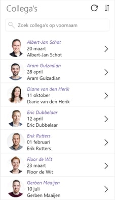
Lately, I created a ‘colleague app’ with PowerApps. With PowerApps it's relatively easy to create an app, in this case, based on a SharePoint list. Creating a nice and consequent design for it is more time-consuming.
Tough job
It's a tough job to create a consequent look and feel. And if you decide to change for example a font or a color, you must do this for every element in your app separately. I know there is some sort of pseudo-CSS-equivalent in PowerApps but for me as a non-developer, this is too much coding. (https://davidlozzi.com/2018/02/21/custom-style-sheets-for-powerapps-pseudo-css/)
Styleguide
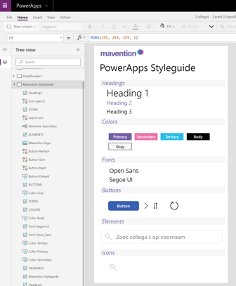
So that’s why I created a PowerApps style guide. It’s just an extra screen in your app that’s not visible for the app users. On this screen you place all the colors, fonts, elements, etc. you’ll need in your app. For this simple app, I created a couple of headings, colors, fonts, and buttons.
Reference the elements
In my Powerapp I now reference the styling of the elements created on the style guide screen. In this example, I style the heading 2 (H2) in my app based on the color and font of the Heading2 element in the style guide. Now, if someone decides that the font and the color of all the H2 elements have to change, you’ll only have to adjust the element on the style guide screen and all the elements will change accordingly!
Re-use the styleguide
The effort of creating a style guide will pay off even more if you must create multiple apps in the same company branding. Just re-use the style guide. Within Mavention we will create every PowerApp based on the same company-branded style guide. This will create a consistent look and feel and it will save us a lot of time!

